Tuesday, 31 January 2012

Print Elective.   31st January, 2012.

I started my second elective yesterday.    On Friday we had a chat with Des and Fiona and they gave us a run through procedure and what was expected of us in the Print Workshop.   We also got our project brief 'space' and we got the weekend to think how we might interpret it.
Over the weekend I defined space as 'a continuous area that is free, unoccupied, available, as distance from one another, as room, interval, gap, as stacked, high-rise, multi-storey'.
However as the weekend progressed it became more and more apparent to me that space could mean something else entirely.   After very fraught discussions (being kind here) with two daughters planning a 21st birthday party, I needed head space and the only place to find this in my house last weekend was in the shower.
So yesterday I started to look at this personal space and how I was going to create a visual image from this experience.    I was hoping to convey a feeling of noise, mayhem, and argument outside the shower door and that it stayed there and didn't invade the shower cubicle.   Again how could I do this visually.   Colour was the answer and I looked at the colour wheel and harmony and disharmony of colours.   Other images I considered for the brief were alternative spaces such as the capsule hotels in Japan, rooms made of big cement pipes, rooms made with giant beer cans and pods high in the trees in Canada.

These are some other spaces I looked at for the project.

capsule hotel in Japan

inside the capsule hotel


room pod in Canada

room in a giant beer can in Denmark

I realised after I had picked these images that they were connected to the the shower in the sense that these spaces are also very personal, a refuge or a space to fit one person.


Below are the pictures I took in the shower, looking out and they are what sparked my initial ideas.


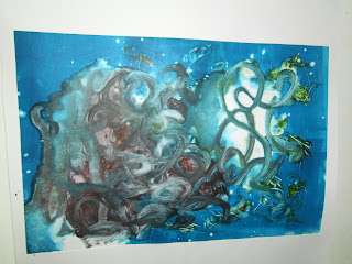
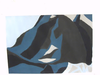
Here are the results of my mornings work in print.   The idea started to take on a life of its own once in the print room  and as well as disharmony I started to look at splash.  I tried to convey this through mono print using white spirits.  I hope to revisit this on Thursday and look at other ways to make marks and splash against the glass.


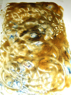
I had a lot of bleeding under the plasters I put on and this was because the white spirit diluted the ink and it got squashed out under the plaster in the press.   In print no 5 I got the affect I wanted by doubling the plaster so it soaked the ink much better.    Des tells me I can rework the others  and I hope to do so next time I'm in the print room.  The last prints are traces left behind on the newsprint I used to soak up some ink residue before I put them through the press.   Didn't bin them because I thought they were interesting in themselves and I just kinda like them.

End of painting elective, 28th January, 2012.

Can hardly believe our two week painting elective is over and gone.   To-day sees our worked marked and assessed and we move on to our next elective.   My next undertaking is print and I can't wait especially after having had a peek at the work that has just been done.   However first things first.   Last time  I blogged we were doing our weekend project for paint and I did promise to post my version of the 'Queen' however it turned out.    Well not wanting to break a promise I'll do so.   Its not finished, I never touched her crown and I didn't get to finish her lower face and neck.   Some of us felt that we needed more than the weekend to complete it.   I didn't spend all weekend on it, but I did spend a considerable amount of time working on it over two days.  

This is the result.   The first one is mine and the one below is a copy of Lucien Freud's.   I had great fun doing this, it was a project I really enjoyed.   I was pleased with my effort because I have never done anything like this before.


Below is a better photograph of the two side by side.


During the last week we did a lot of work painting our installations using tone.   We mixed our own black or dark tone and added two others with white.   We also used brushes something I found hard because I was much more comfortable using card or the palette knife, but there is nothing like a challenge.
This is what happened.


On our last day painting we also used warm tones.   I was working with blues so I added orange to warm up my tones.    This was added to the tone I had created first and I added white to make two other warm tones.
Below is the result.


The final exercise we did was one in mark making and before we knew it our elective was over.    The two weeks flew, they were intense and most of us were very tired going home on the Friday.   I have to say, tired and all that I was, I will look back on the Painting Elective as being most enjoyable and hope my other two selections are as satisfying.   So thank you Grainne and Sylvia.


Saturday, 21 January 2012

Painting Elective.

Its the weekend already and the first week in painting is gone.   Wow that was fast.   On Monday we all spoke about the images on our boards.   We also had a slide show that showed the work of Contemporary Artists.    On Tuesday we were given a brief to pick a 2d or 3d work of art and to respond to it in the form of an installation.   This was to be ready by Thursday.   On Tuesday afternoon we did a painting work shop where we did a blind painting exercise, painting with card and painting the negative spaces.    I found it hard to get my head around painting the negative spaces but overall I enjoyed the workshop a lot.
Wednesday saw most of us trying to put our response to our work of art together.   I picked Henry Moore's 'Mother and Child with petal skirt' as my subject and this is how I responded to it.  


I used tin foil, tumble dryer pipe and stocking in the construction of this piece, what I wanted to convey was the unbroken link between the mother and child, the chord and how as a mother you never really cut that bond or link.  Of course physically it happens at birth but emotionally and mentally its always there, I suppose that's love.   Anyway this is far too deep, easily known its the middle of the night and I can't sleep.   However my construction was too sculptural, and not interesting enough to paint, so I responded again, this time to the pleating element and this is what happened.  
Contextually I was looking at the work of Thomas Hirschhorn.


Here I used brown paper, tin foil and various types of chord and string.   I pleated the paper and used it to build a structure out from the wall.   My first installation.

On Friday we had the best fun yet, we were to interpret our installation in paint.  We did blind paintings of it first, then thumb nails of the areas we wanted to paint.   We were using palette knives and our colour palette was a self mixed black with four other tints of the colour blended with white.   It got somewhat frustrating when the paint wouldn't do what I wanted it to do, but it didn't take from the fun of it.   This is what happened, my two finished results.


My homework for the weekend is to copy a Lucien Freud portrait colour for colour, brush stroke for brush stroke, sounds like fun doesn't it.   Not sure my attempt will be very Freudesk but tune in to see what happens. I promise I will post my appropriation whatever happens!  

Friday 13th January, 2012


Hi Friends, hope everyone is feeling better now that the assessments are over.   Its been an odd week in college.   Strange having no studio work to do.   Calm before the storm I think.   Monday sees the start of Electives, my first one is Painting, so this afternoon I spent some valuable time in the library.   Grainne and Sylvia asked us to think about images that excited and inspired us during our 1st semester and to collect some of them for a pin board.     I was looking at the drawings of Henry Moore, in particular his series from the underground.    Why do I like these you may ask.   Well that's easy, while doing the life drawing classes I was very keen on a way of working that Riosin described as drawing from the inside out, looking at where the model's weight was, how she was connected to the space around her.    So when I was drawing I imagined I was making her out of wire or clay and tried to convey that in the marks I was putting on the page.   When I look at Henry Moore's drawings I get that same sense.

Below are some of my favourites.


'Woman seated in the underground' Henry Moore

The other Artist I will be putting on my pin board is Claude Heath, again another practise we employed in life drawing was blind drawing and it was something I enjoyed quite a lot.   Claude Heath's work has a lovely sense of freedom about it and yet you get the feeling that he is mapping his way around what he is drawing,  not missing anything knowing his subject intimately capturing every detail with his line.    

 Here are some examples of his work.


Wednesday, 4 January 2012


Hi everyone, back again, my project tonight was to experiment with food colouring, acrylic paint, spices and sugar.   Towards the end I decided to add fabric into the mix as well.  I started by making sugar syrup as you would if you were making sorbet or making sugar strands.  Then I added yellow food colouring,turmeric, and acrylic and poured it on to the page.   After swirling it about and letting it have a life of its own I added red food colouring leaving it to bleed its way into the yellow syrup.   This is what I ended up with.


At this stage the sugar syrup was getting very thick so I added more water to it to thin it out, next I poured it on to a page and added more colour to it.   Once it hits the page it starts to cool and solidify so you can kind of manipulate it.

In these ones I have kept some of the yellow and just added blue.


Again as it gets thicker I have added more water and used it thinner.


While I was playing around with these ones I forgot to take it off the heat and the syrup started to caramelise and go dark brown, it also smelled just like toffee.  Below are the darker results.  The upper part of these have that fudge colour and I have added blue,black, red food colouring and acrylic paint to the bottom.


Just as I was about to finish I wondered what would happen if I added fabric into what I had already done.    Again as in a previous project the work of Annette Messagner came to mind and I was looking at how she used netting and sheer fabrics in her work creating a veil.    I like the idea, but here I'm not using it to hide anything just to add another dimension and to see how it reacts with the wet sugar syrup.
This is what it looks like.


If you'd like to try this, its very simple, just sugar and water.    However I would would advise caution because the sugar syrup gets very very hot and can burn  skin very badly, so be careful.